Showing posts with label Major Project - Photoshop. Show all posts

Monday, April 24, 2017

Major Project - What I Learned through Photoshop

Major Project - What I Learned...


OK, so after many, many hours watching YouTube videos, Lynda.com tutorials, Adobe Help resources, and several pow wows with a graphic artist, am I a Photoshop Master? Hahaha... not quite. I am seriously humbled by this process. I had anticipated doing much more with the project, but it's not from lack of time spent... it's from the programs being much more complicated than I thought they'd be! I'd wanted to experiment with Illustrator and InDesign as well, (and I tried with Illustrator but got so confused I went back to the relative safety of Photoshop!)  But I learned quite a bit with Photoshop and I'm inspired to continue learning. All I'd used it for previously was very basic retouching and album design - just arranging photos, not altering them much.  But now - as you'll see from my tutorial (which I had to reduce from 1 hour, 4 minutes to 15 minutes! Not an easy feat! So, technically I did learn a second program - Camtasia - a video screen recorder/editing software that was really novice-user friendly but it took some Help tutorials to get that one down too!) Camtasia is a paid service, but I did the free trial, which unfortunately leaves an annoying watermark across the screen.  And after I struggled for over an hour to get it to upload to Youtube, I realized it was because of the length. So I spent several more hours editing it down!  It's amazing how much time it takes to shorten the time of something!!


It's a little disjointed and I'm not totally satisfied with the result... but it was a respectable first try at a tutorial.  Besides...
All in all, I learned how to make several things with Photoshop: How to superimpose one image on another, and create shadows...


I created 2-sided invitations, learning how to manipulate text, import multiple images, and incorporate the fundamentals of design... 

I made a menu - the hardest part of which was making individual cupcake photos when no such pictures exist, so I had to make composites to fill in sections that were blocked from view....


After failing miserably to create a logo in Illustrator, I "made magic happen" and turned the vision in my head into a real logo... 


 Finally, I took a photo of my daughter at her birthday and manipulated it into the extreme - altered her limbs, "cartoonified" her, and incorporated her in to the Cat in the Hat book - which I will use for a thank you note, I think...


So, that's five digital artifacts that I couldn't have made before this project. I'm pretty proud of myself.  I may not be a "Master" of Photoshop, but I've certainly gained enough knowledge of methods of graphic design and using the software that I feel like I'm well on my way to becoming a competent teacher!


Being that this party was just Saturday, and Sunday was spent cleaning up the whirlwind... I didn't have time to incorporate any other of these photos into a completed new advertisement for GoodWitch Party Magic... but it's my blog, so I'm gonna share some photos with you anyway!  Here's my awesome "Chapter 2 - Story Book Party"...


I was the Cat in the Hat
I made Thing 1 and 2 costumes
for the Birthday Girl
and her favorite doll.
Although she had a
Thing 2 headband, she
would only wear my cat ears.
Storybook Cupcake Display

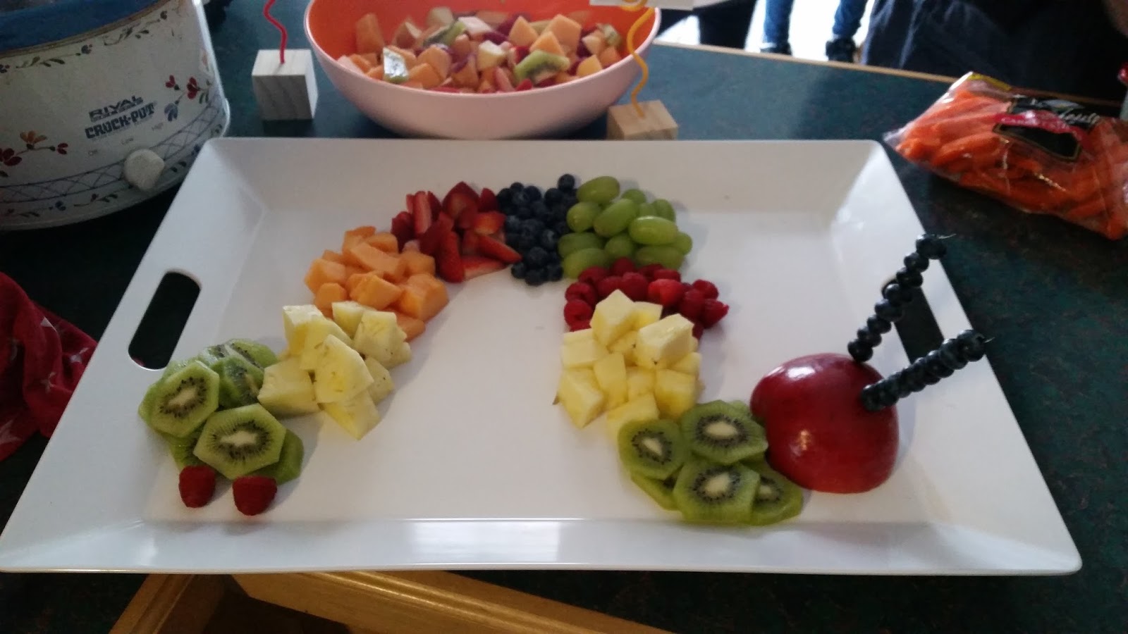
Very Hungry Caterpillar fruit tray

Madeline and Give a Mouse a Cookie

She wanted more frosting...


Hand-painted Very Hungry Caterpillar
beanbag toss game for the toddlers.


I did throw a quick illustrated menu together, using the menu I designed (via Photoshop) for the party, and I remembered to take individual photos of cupcakes this year, so progress! 

 Whew.  That weekend flew... 2 straight days of baking, decorating, sewing, planning... cleaning... then homework and finals stuff.  Thank goodness this semester is almost over!  I'm exhausted!

Next time you need a little party magic...especially over the summer... just let me know :)


Wednesday, April 19, 2017

Major Project... Making Progress with Photoshop - Logo and Menu!


Making progress in Photoshop!  Finally!


So, after becoming so frustrated with Illustrator that I had to stop myself from throwing my laptop into the lake, I decided that I would attempt to make the logo I am picturing in Photoshop for my imaginary cupcake/party planning business. TA-DA!!!

Isn't that adorable?  It only took me about an hour... maybe a little more.  I know that logos are better suited as vectors - which, I learned through the magic of the internet, are basically files that could be enlarged infinitely (think, billboards and bus wraps).  Since I have no bus to wrap or billboard to design, and for the safety of my laptop, because I have become more comfortable in Photoshop over the past few weeks, I figured why not try it.  I watched a few YouTube tutorials... like this one:


And I was off and running.  Maybe since I at least have a little experience with Photoshop, the tools are more intuitive for me than the mysterious interface of Illustrator.  So it wasn't that bad!  I'm actually pretty proud of my Good Witch Cupcakery and General Party Magic logo! It's good to feel like I finally accomplished something worthwhile with this Major Project I so crazily proposed!!

Next, I figured I'd make a cupcake menu for a Wizard of Oz party.  I wish I had thought to take individual pictures of the seven different types of cupcakes I'd made last year... but at the time it never crossed my mind - at 4 in the morning - as I was making 2 dozen tiny fondant bows and using icing to glue Hershey's Kisses to mini York Patties to make witch hats.  


So I took as many of the big display photos that I could find and attempted to locate unobstructed views of each variety.  If I found one then I just cut the pixels around the cupcake that I wanted, placed it on a transparent background and dragged it as a new layer onto my menu.  The hard part were the few cupcakes that I didn't have whole-form images of.  So I cut out what I could, then copied and mirror-image flipped chunks of the bases or frosting and Frankensteined together 2 complete cupcakes. Bet you can't tell which ones...


One of the most important things I learned was how to manage my layers.  With 7 different individual cupcakes, 14 text boxes and 7 colored rectangles plus the division lines, etc.  I kept getting confused.  There were like 40 layers!  BUT, from my Lynda.com tutorial that my graphic artist friend was nice enough to give me access to (but I cannot pass the link on to you) I learned that you can group similar layers in to folders, which you can collapse and make your project way more manageable.  

See, I put all the cupcake names into one folder...

Then I can collapse the folder with the little arrow by
it and get them out of my view!
Huh.  That was definitely something new for me. I like learning new things.  And now, with two completed digital artifacts for my imaginary business, in the next few days I thing I'll try some layer masking like I did in the Squirrel post (a late night rabbit-trail I went on last night...) and make a composite where I make an actual yellow brick road fade into the felt one that is a part of the cupcake display... you know, like the wooden Emerald City in the photo above is the "real thing", just really far in the distance... if I can get that in to an effective image, I just might record how I did it and present it on my next blog.  Stay tuned! 


Tuesday, April 18, 2017

Major Project... Feeling Squirrelly - Getting to know Photoshop - ONLY Photoshop


Taming the Inner Squirrels... and Playground Ruffians...
and other Photoshop Adventures


OK.  Time for some alteration on the "Master Plan" here.  Because Adobe products are so immersive and capable of so much, I will devote the entirety of this project to Photoshop. Since I will be taking an Independent Study this summer for learning more kid-friendly computer design programs to incorporate into my Art Ed curriculum, I'd rather know one program really well for now, rather than barely grasping 3 different ones. It's been too overwhelming, because every time I'm struggling with the Photoshop part, there's a naggy little voice in the back of my head going "Just wait until you get in to Illustrator, sucker!  You don't even know what a vector really is! Mwahaha..."  Or something like that.  My inner voice can be a jerk sometimes. 

But instead of listening to the evil squirrel, I think I'll let my more zen inner voice come to the surface.  The one who says it is better to do one thing really well than to knock myself out trying to do too many things adequately.  In a week where I am trying to work at my job, write a massive term paper, navigate final group projects, take care of all the other little assignments tossed in there, throw my daughter a birthday party with 40 people, take her to the doctor's because not only is she having minor surgery after her birthday - but some frisky little toddler bit her face on the jungle gym because she wouldn't kiss him. No joke. Bit. Her. Face. I know this is not related at all to the task at hand, but it's my blog and I can talk about whatever I want. BIT.  HER.  FACE!!!  In her haste to get away from the little monster, she tripped and scraped her knee and scratched her nose pretty bad. Now she has scratches, bite marks, bruises, and an unrelated bug bite.  All in time for lots and lots of birthday photos. Fantastic.  But hey... and here's where we get back on track... I'll know how to Photoshop all that crap right off of her. It's good to be techy! 

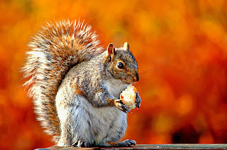
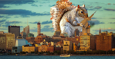
So today I decided to research exactly what "Layer Masks" are.  For that giant term paper I mentioned (my reflections on my first semester of field experience), I'd had to alter a few photos I'd taken of handouts and art projects.  They were all slightly skewed pictures because of the distortion that happens when you don't photograph head-on.  I messed around with the Transform tools until I found "Warp" to be very helpful and now you'd never know the images in my paper aren't scans of handouts in my possession. As I was testing methods out for fixing the perspective, I keep coming across items about Layers... Adjustment Layers, Fill Layers, Layer Style, Layer Masks...  I could figure out what most of them do, but I wasn't sure about the Masks.  So I found a helpful little tutorial: Adobe Help for Layer Masks.  Apparently, I'm in a bit of a squirrel mood - perhaps the threat of "baby-rabies" my daughter could have caught has me fearing rodents... I don't know.  But I decided to experiment a little with clipping masks. 


+

=


Here is my quick product.  Not spectacular, and a lot could be cleaned up... the Squirrelzilla destruction intensified... but I just wanted to experiment.  This has nothing to do with cupcakes or parties.  But I'm tired of looking at cupcakes and parties - between this project and planning a 2nd birthday - I'm partied out already.  So I've stooped to squirrels.  Oh well, it did the job.

I have yet to "film" my screen activity because my methods are still so sloppy, and no one wants to watch me stumble through a demonstration... so I'm building up a little more expertise.  Thus these little experiments.  I've decided I like layer masks because instead of cutting the material from one layer that you don't anticipate not needing, you are just blocking them from view and you could make them visible again quite easily if you misjudged what you wanted hidden from view.  This would have come in handy doing the dozens of "head-swaps"  I did in group photos for the wedding photographer I worked for. There's always that blinky uncle in the back row who needs to be photographically decapitated and reassembled with functional eyes.  The masking tool could make for a really seamless swap.  Very cool.  Maybe I wasn't "nuts" doing this project after all.  

Sorry, I couldn't help myself.  Just feeling squirrelly I guess.


Sunday, April 16, 2017

Major Project Update.... Ugh.

Major Project Update.... Ugh.


Wow. As I just mentioned in my Productivity blog, it turns out I can barely learn Photoshop in the time I can allot for this Major project - let alone the 3 programs I had intended on.  These programs are so complicated nowadays.  They are definitely more for professional editing than for introducing middle-schoolers to graphic design.  Or mildly experienced future art teachers.  I was starting to get frustrated with Photoshop, so I decided to work on my logo in Illustrator.  Ho. Ly. Cow. 


I know exactly what I want my final logo to look like. I could even draw it out for you!  I have all the elements I need, it's just that I can't get the program to do what I want. I spent several hours trying it myself. I thought of a name, a slogan... I found and downloaded a font - a first for me! But that's where the successes ended. 

I've perused YouTube, referred to Adobe's Help resources there's even an Illutrator Logo design help, even had a short pow- wow with my graphic designer resource person.  We literally sat in front of my laptop for an hour messing with it.  All I want is for the pink text to be incorporated into the bottom arch of the oval - like interrupt the line but continue the shape visually.  I kid you not, we couldn't do it! He kept saying how un-intuitive the Illustrator program is. 

Apparently he uses something called Corel and he said this would take 3 minutes in that program.  He even showed me where the buttons would be to do it! Seriously - we could get the text to link to the shape.  We could get it to "flip". We got it to rotate (the wrong way). But it was impossible to get the text in to the right position, facing the right way.  Very frustrating. I don't know if I'll be able to really become familiar with both of these programs by the end of this project. I will give it a go. I've got no choice!  But I just wanted to update you all... this is not going well!!!  I'm going to try that Lynda program he told me about - maybe that will help! At this point, it couldn't hurt. Because there's more I want to do - manipulate the "Good Witch" text, make the "W" look like a wand with the star serving as the dot for the "i" - but I need the oval the way I want it first!   I'm half tempted to just try to do the logo in Photoshop and devote the project to just Photoshop. There's certainly enough to learn that it would be a thorough learning experience. 


I think the problem is that this is ALL so "un-intuitive" for me.  Normally in creative endeavors I know my medium.  I know how to use a brush and paint and turpentine and linseed oil to make a great portrait.  It's not easy by any means.  It takes me months to end up with a painting I'm proud of.  But it's all about experimenting and seeing just what my medium can do. What effects I can achieve.

See, this stuff I can do!!!

With this Photoshop, Illustrator thing I already have a finished product in my head and I can't figure out how to use this blasted "medium" (my computer) to make it a reality.  A painting evolves.  I have a general concept but just go with the creative flow as I work.  With this graphic design stuff I am trying to do such specific actions to achieve an image I already have planned.  A professional can do it (with the right software, apparently), that's how they work - taking client's vision and making it real.  An amateur like me is just getting overwhelmed.  It's hard because I don't know how to word exactly what it is I'm trying to do in order to find the resources to instruct me.  

I'm trying to remind myself this is my first "blended learning" class, that I've never tried to teach myself something techy completely unsupervised. As much as I've enjoyed the class-and-blog combo for this class... as far as Adobe goes, perhaps a self-directed learning exploration of this medium was not the way to go.  This might be more of a thing I need an instructor over my shoulder, pointing things out and explaining... answering my specific questions.  Hopefully I figure this out soon, because I'm running out of time. 


Monday, April 10, 2017

Major Project - Playing Catch-Up, Mommy Style: The Birthday Party


Photoshop
Playing Catch-Up, Mommy Style: 
The Birthday Party


Related image

So, it's been a little while since there was any sort of progress on my Major Project of learning Adobe Suite.  I admit it, it hasn't been on the top of my list lately.  You see, recently my daughter and I have reached the milestone of the "big girl bed" - right after watching her do an impressive yoga move to get one foot completely over the railing of her crib and smiling at me in a crazed future bungee-jumper sort of way.  That was it... thank goodness Papa (my Dad) is an accomplished carpenter and could whip up a toddler-bed conversion rail to transform her crib into a bed (they are supposedly available to buy and match her crib exactly, but Babies R Us never has it in stock!).  So Papa looked at the picture online and over the weekend made a perfect one.  Awesome.  Except... now my little chimpanzee has the freedom to climb in and out of her bed unassisted.  During the day she repeatedly goes back and snuggles with her stuffed animal menagerie for short periods of time - not napping, just relaxing for a moment.  At night... at, oh say, BEDTIME which until now has been a relatively uneventful 7:30 to 8:00 ritual... that bed becomes a lava-filled volcano of doom into which I spend an hour or two trying to coax my unwilling sacrifice.  She's thirsty. She wants another story.  She wants mommy to lie with her (i.e. contort myself into a nearly impossible yoga move of my own to accommodate her and said menagerie). She needs to reorganize her shoes. Look! The bed's a trampoline! One night she got up and disassembled the humidifier I had going because her nose is stuffy. I kid you not, on Wednesday at 9:37 I was exasperatedly watching her wolf down an impressive serving of meatloaf since she couldn't sleep because she was hungry.  I tried explaining that some day, probably when she has a toddler of her own, she will beg for the privilege of going to sleep.  She was unimpressed. And after consuming half her weight in leftover meatloaf she wanted to go play in her playhouse.  NO!!  So, the past 2 weeks, when I should have been working on homework after her bedtime, I have been negotiating with a tiny terrorist instead. 

I was able, however, to do a project that was slightly unrelated to my ultimate "mock bakery/party planning business" that I've been using her Wizard of Oz 1st birthday photos for.  I have been playing with my images on Photoshop for several hours, but don't have any finished products yet.  This week, however, I made her invitations for her 2nd birthday - which will be a "Chapter 2" storybook theme. The girl loves to read... so why not include all of her favorite characters?  I guess it is inadvertently related to my project, I mean I am planning a party. Although I'm sure I broke some sort of Creative Commons regulations by utilizing unlicensed characters (but I'm not making any profit off these things, I'm just throwing a party - spending money, actually!)  Still, this project involved cutting figures out of backgrounds, arranging text, resizing images and organizing them into a pleasing design... all basic components that I would be teaching an introductory graphic design course. Here's the front and back of my finished product - with identifying info blocked out, of course.


This took my a few hours - since I wasn't specifically doing this with the Project in mind, I forgot to time myself.  But I'd say 3 or 4 total between writing the amazing poem, finding and altering all the images and composing the two sides.  I didn't "record" the process either. But here's a step by step breakdown of what it took.  
1) I did the poem first and tried to incorporate as many books as I could think of - for the sake of proper citation I used Brown Bear, Brown Bear What Do You See? and The Very Hungry Caterpillar by Bill Martin Jr., Green Eggs and Ham and Cat in the Hat by Dr. Seuss, Where The Wild Things Are by Maurice Sendack, Madeline by Ludwig Bemelman, The Little Engine That Could by Watty Piper, If You Give a Mouse a Cookie by Laura Numeroff, Curious George by H A Ray, and Little Critter by Mercer Mayer.
2) I chose a Papyrus font and made separate text boxes for each line of the poem so I could easily manipulate them.
3) I found images of all the characters/books referenced. I used JPEGS.  Sometimes it was hard if there weren't any images of the character alone on a white background, just within the cover or page illustrations, so I had to carefully erase the backgrounds... which in the case of furry Critters or the detailed Engine that Could was a big pain but good practice I guess.  I learned that the higher the resolution of the image the easier it was to manipulate because if I zoomed in too far on a poor quality image it became almost too pixellated to identify or work with! Eventually I had each character on a transparent background so I could place them close enough to text without blocking some. 
4) Each character went on it's own layer, again, for ease of manipulation.  I arranged them around the text, paying careful attention to spacing, composition and keeping balance and harmony within the whole image. 
5) When I had started the invite I had intended it to be one sided, with a short poem and then all the necessary party info.  But as usual, I got carried away with the creativity aspect and was (gasp!) enjoying myself working with the computer. So the poem went long and required it's own side.  Luckily, I remembered my graphic artist friend who has access to all sorts of cool printing stuff could easily hook me up with a small amount of my fabulous invitations at little or no cost. 
6) So I started on the front, using the same font and characters I made a short little snippet phrase, a Chapter 2 heading, and incorporated the Where, When, and RSVP info. I had fun manipulating the text, making some vertical, some horizontal.  Doing my best to keep the text justified (evenly spaced in length) within their boxes, I applied the artistic "rule" of 3s and 4s (compositions look best if ajor elements are repeated 3 or 4 times) and made 3 text boxes (4 if you include the Chapter 2).  It's funny how even in graphic design, all the stuff I learned as a painter comes back to me naturally.  I didn't really do this stuff on purpose, looking back they were subconscious decisions. I'm going to have to remember if I'm ever teaching that these principles of design will not be inherent knowledge for most students and I'll have to tailor my lessons accordingly. 
7) I emailed both rendered (flattened and not-easily-changed but ready-to-print) JPGS and the unrendered PSD files to my friend (in case he needed to alter something or incorporate a bleed line (the space to be left blank on a printed design to accommodate a printer offset and cutting).  Within a few days I had my creations in hand.  It was then I noticed I had completely forgotten to include a time on the invitation.  I'm attributing this to exhaustion.   
8) So, out came the Sharpie and I hand-wrote in my best Papyrus imitation "2pm" on 30 invitations. Fun stuff. I guess I learned the necessity of good proofreading - although to be fair, I looked at it, my mom looked at it, and my printer looked at it... no one caught it!  Still, it pays to be more careful. 
So that's it.  My unintentional learning experience that stemmed from a real-life need.  Love it when things work out like that.  Now, if you'll excuse me, I actually have the opportunity to crawl into my own lava-free "big girl" bed and get some sleep because the chimpanzee is napping. I'm gonna need it... tonight the battle begins anew... 


Monday, March 20, 2017

Major Project - First Week. I've learned how much I need to learn!!

First Week of my Major Project... 
I'm Not as Good at This as I'd Hoped...

Ok, so I've started experimenting. And although I know how do do some simple things from my work with the professional photographer, that was just retouching photos and laying them out into albums.  Adding things and changing images dramatically is waaaay different. 

I did learn something though...even professionals can struggle.  My graphic artist friend came over to help me. At the advertising company where he is the Art Director, he mostly uses Corel and keeps extolling it's virtues to me. I explained to him that, while that may be state of the art professional software... it's highly unlikely a secondary school would have access to that and that Adobe suite is kind of the standard.  He concurred and we dug in to Photoshop.  

Prior to our teaching session, I had experimented a bit. I pulled up Flickr to find a good image I can legally use from Creative Commons (see my other blog on proper use of copyrighted and creative commons imagery - yay for cross-topic connections!) Anyways, since I had decided to make a fake cupcake business and mostly use images of the Wizard of Oz-themed first birthday party for it (because that involved seven different kinds of cupcakes!), I'm going to call my "business" Good Witch Bakery and Party Planning. I pulled my own image of my daughter and I, plus a creative commons image of the yellow brick road through the woods. 

Side note - the actual famous 1939 Wizard of Oz movie with Judy Garland and directed by Victor Fleming is not part of the public domain. It belongs to MGM. I checked.  Here.  I hadn't really thought to check prior to planning that party last year - I mean, I didn't make any money on it (in fact, I spent a ton of money!!) But, according to the legalese - making a costume to resemble the movie characters is not a crime, nor is referencing elements of the film.  Essentially, my daughter was allowed to wear "red shoes" but not the "Ruby Slippers."  Honestly, this all seems quite fuzzy to me - especially because the original book by L. Frank Baum is part of the public domain due to its age.  

Returning to the project... so my friend Luke uses Corel but when he does use Photoshop, intimidating to watch him struggle a bit with showing me how to use my new software. There were things he wanted to do that couldn't be accomplished in his usual way because the tool functionalities had changed.  So we had to experiment together! All the while I was thinking, "Well, now I don't feel so dumb! But also, how discouraging that even learning this software doesn't necessarily mean I'll be an effective teacher... because who knows what other advancements or changes will be made by the time such an opportunity presents itself!"  

I placed the image of myself on the road without assistance... extracting our figures from the original image and placing on the road photo (which I flipped from it's original so it looked like it was going behind us.  I wish I had a screen recording of this but I'm struggling to find a good, free program.  Stay tuned.  Anyways. I wanted to ground my figure with a shadow.  Sadly, this photo doesn't include my feet but still - I wanted to try a shadow.  I tried making a "Drop Shadow" but that won't lay on the road like I want it.  So we found a short video here: 


I found this quite helpful.  Here's my finished product of me superimposed on a yellow brick road. And see the shadow to the left of us? Pretty cool:


I didn't get to spend as much time on this project as I'd hoped this week. Maybe 4 hours between working on my image and general instruction and playing around with the program. At the moment there's a lot going on in my life. I was lucky to squeeze in the time I did. But next week I know I'll have more time... plus a lengthy (like 12 hours!) Lynda.com instructional course on Photoshop that I'm excited to take. Can't wait to see what I learn! 


Saturday, March 11, 2017

Major Project 1: Learning Enough Adobe to Appear Competent(ish) to Teach a Graphic Arts Lesson


Becoming a Competent Graphic Artist:
My Journey to Learning to Use Adobe Creative Cloud


So the Final Project for this Instructional Technologies Class is to learn something new - using a variety of technologies and resources and PLN stuff -  and document my 50 to 100 hours of learning via this blog.  So I suppose I should start with the premise of my project and do a sort of "pre-assessment" of my skills.  Which I actually inadvertently did back in September - the experience of which prompted this project.  A family friend who is a very successful veterinarian knew I was down on my luck and asked me to make a logo for the vet office.  I am an artist, so naturally, they assumed logo making would be no problem for me.  Well it was. I could free-hand draw it without problem but I could not adequately convert my idea into a more polished digital format.  Michelle, the vet, had the new Adobe suite on her home computer so she let me come over and play around.  I don't think she quite believed me when I tried to insist that I knew very little about logo design but I think she got the idea pretty quickly as she watched me fumble around... going between Photoshop and Illustrator.  First I tried to take my hand-drawn idea and clean it up in Photoshop... but the text wasn't working right.  So, knowing there is a program specifically designed for such a creative endeavor, I tried Illustrator.... and pretty much gave up on that because I don't even know what a "vector" is let alone how to design one!    It took waaaay longer to execute a relatively simple design than it should have. I didn't keep track of the hours spent but I'm going to say at least 8 if not 10 hours went in to making this:


Here's the rough sketch I came up with to show my idea to Michelle...
and foolishly thought would be no problem to do graphically


This is a sweatshirt with my hard-earned finished logo.  It's simpler than I wanted...  I love how the text turned out but the line-work on the animals is crude.  Still, it was the best I could come up with at the time. 
And my "client" liked it. 

The more I look in to my future career as an art teacher, I am realizing there is no avoiding the computers and other technology …so I might as well embrace it and learn it well enough to teach the basics.  I am quickly realizing that I will be much more marketable as an art teacher if I can instruct basic graphic design. I do have minimal experience with Photoshop (with much older versions than what's out now). I have not done much more than retouch wedding and senior pictures – and some basic album design when I worked for a professional photographer.  But that software is now seriously outdated and I used a lot of pre-made “Actions” – meaning most of the work was already done, I needed only to upload the photos and hit Play and voila! Pimples gone! But that doesn't help me design anything

So for this project I decided I want to be able to do that myself: to manipulate images and create passable logos. So I intend on learning to use current Adobe Photoshop, Illustrator, and InDesign or Muse programs proficiently enough that I would feel comfortable teaching them myself.  

To have an over-all theme for this project (or "lesson plan," if you will) I’m going to “start a cupcake business.” I have no time to actually bake at the moment (truthfully, it’s going to be hard to work in the hours for this project!) so the business isn’t feasible right now, but perhaps I could actually pursue it in the future. I do enjoy baking and have some awesome pictures of my daughter’s Oz-themed first birthday, for which I went all out.  I can manipulate the photos I have of the soiree with Photoshop and develop both some advertising-quality images. Then I can design a few logo options. Then I’ll make some advertising – either a website or brochures/posters/ads. Over the next six weeks I will try to spend 10 hours each week working on the project. I will document my weekly progress via my blog and at the end have a viable “business” to promote.  That's the plan, at least!

If you're not familiar with graphic design software - here's a quick list of what I'll be using from Adobe Creative Cloud:

Image result for difference between illustrator and photoshop

Haha, just kidding.  It would take far too long to learn all of these in a few weeks!!
Photoshop (obviously) is to edit photos.  You can do everything from simple touch-ups to creating high quality graphics.
Illustrator is for creating vector images to be use for company logos, promotional uses or even personal work, both in print and digital form.  What is a vector? Well now I know that, "unlike JPEGs, GIFs, and BMP images, vector graphics are not made up of a grid of pixels. Instead, vector graphics are comprised of paths, which are defined by a start and end point, along with other points, curves, and angles along the way. A path can be a line, a square, a triangle, or a curvy shape. These paths can be used to create simple drawings or complex diagrams. Paths are even used to define the characters of specific typefaces. 
Because vector-based images are not made up of a specific number of dots, they can be scaled to a larger size and not lose any image quality. If you blow up a raster graphic, it will look blocky, or "pixelated." When you blow up a vector graphic, the edges of each object within the graphic stay smooth and clean. This makes vector graphics ideal for logos, which can be small enough to appear on a business card, but can also be scaled to fill a billboard."(Thanks TechTerms.com) 
InDesign is a layout/publishing tool used to create works such as posters, flyers, brochures, magazines, newspapers. 

Muse is a website builder that allows designers to create fixed, fluid, and adaptive websites without having to write any code. (which is the only way this artist could ever put together a website!)

The last two programs are uncertain... I'm going to see how the first go and then decide which way I'm going to go after Photoshop and Illustrator.  But either way, I think three (or even just two) industry-standard programs will provide enough content that I could effectively teach middle or high schoolers the basics.  To learn all this, I'm going to use a variety of sources and instructional tools. I know several professional graphic artists and one advised me that Lynda.com has some well-done online courses.  It is a paid site, but they do offer a free trial. In addition, I will employ YouTube tutorials, videos and instructions from the Adobe website as well as those personal contacts 

To document my progress, I intend on finding a good program that will record my on-screen activity.  I will keep track of the video tutorials that I use and will provide links in my blog.  Then I can write about my weekly learning experience on the blog, share my videos and finished products.  I can even include lists of very basic tips and tricks in case anyone else wants to experiment on their own time.  Here's the first video I found that wasn't an hour long (those are what I'll use - but you don't have to be subjected to that, valiant reader!)


So I've got a few images to play with and I'm going to start my journey this weekend. I'm on my way to not being a total nincompoop with graphic arts software! Maybe even capable enough to teach simple lessons with them. Hooray! 

Here we go...